Topic: Colour basics and visual appeal
This material covers week 7 of the course.
Note that this material is subject to ongoing refinements and updates!
Overview
This theme covers colour theory and working with visuals in design.
What is colour?
The colours we see are just one small part of the electromagnetic field. Generally, most of us have a set of three different cone photopigments in our eyes, which means we all share a similar colour experience. But due to the complexities of how our brains handle this input, we all experience colour a bit differently. Therefore, we can presume that there is a fair bit of subjectivity in how we perceive colour!
There are several types of colour blindness. Designers need to consider how different colours work together. Red-green is the most common type — affecting around 8% of all men with Northern European heritage. There is also blue-yellow (trouble distinguishing between blue and green, and red and yellow) and complete (no colours!!). Designers can still account for various types of colour blindness by using a high contrast of colour values.
The colour wheel
Our understanding of colour largely comes from Isaac Newton’s colour wheel, in which the colours are arranged clockwise in the order they appear in the rainbow (c. 1704). The modern colour wheel has not significantly changed since Newton's version.
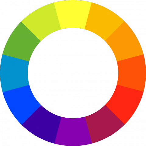
Figure 1: The contemporary colour wheel
The modern colour wheel (pictured) displays three categories of colours: primary colours (red, blue, yellow), secondary colours (created by mixing two primary colours), and intermediate or tertiary colours (created by mixing primary and secondary colours).
The colour wheel gives us some options for choosing colour combinations:
- Analogous: Located next to each other on the colour wheel.
- Complementary: Colours sitting directly opposite of each other on the colour wheel.
- Split-complementary: Combination of analogous and complementary. Best imagined as a Y shape, where the tops of the Y are colours either side of the complementary colour.
- Triadic: Three colours at equal distances.
- Tetradic: Two sets of complementary pairs.
In addition to these combinations, there are also monochromatic colour combinations, which consist of several tints and shades of the same colour. If these pithy explanations are hard to grasp, try selecting different combinations of colours with Adobe's colour tool.
Colour terms
- Hue: The technical term for colour names (red, blue, violet, etc.). Often used only for “pure” colours from the colour wheel.
- Saturation: The purity or intensity of a colour.
- Tint: The mix of white, which lightens a colour (e.g., from dark blue to light blue).
- Shade: The mix of black, which darkens a colour.
- Tone: The amount of neutral grey added.
- Monochromatic: a single colour mixed with tints, shades, or tones.
- Value refers to the lightness or darkness of a particular colour. This is best understood visually — simply imagine removing colour information from an image.
Designing with colour
- Regardless of whether you use analogous, complementary or another method, keep it simple. One main colour and one or two accent colours is usually enough in design.
- Remember to keep all text readable - use high contrast between text and its background.
- Use colour to create emphasis on certain elements.
- Analogous and monochrome combinations make it easy to create a sense of unity.
- Colours can be made more bright through saturation, more pastel with added white, or more earthy with black.
Contrast can be created in several ways:
- Opposites on the colour wheel.
- Warm colours with cool colours.
- Any hue with neutral tones (i.e., greys).
- Light values with dark values.
Creating colour in software
In more advanced design software, it is common to choose or input colours based on RGB (Red, Green, Blue) or CMYK (Cyan, Magenta, Yellow, and Key/black) values. Hexadecimal (#) values are used in web and app design. Knowing how to work with these values is useful for sharing specific colours between different applications, or sharing them with another designer.
It is also important in any design software that you set the colour profile to RGB if the content is for digital use only or CMYK if it is intended for print. Files set in RGB will look different once printed. RGB colours tend to look much more dull when printed.
Colour tools
Colour scheme generators:
- https://coolors.co
- https://www.materialpalette.com
- https://www.khroma.co
- https://color.adobe.com/create/color-wheel
Back to top | © Paul Haimes at Ritsumeikan University | View template on Github