Topic: Infographics
This material covers weeks 11-12 of the course.
Note that this material is subject to ongoing refinements and updates!
Overview
This theme covers infographics and discusses layouts once again, but covers some new ground.
Infographics
A way of presenting data or other ideas in a way that can be processed quickly. As the reading says, infographics are a way of “cutting to the chase”. Some forms of infographics, such as maps, charts and graphs, have been in use for a long time. Others, such as “tag clouds” (see below) are a more recent invention.
Take the example from Chapter 10 of the Hagen and Golombisky reading:
“A recent poll showed that 20 percent of the residents in Precinct A voted for candidate Smith, 10 percent voted for candidate Jones, 65 percent voted for candidate Doe, and 5 percent voted for write-in candidate Anderson” (2017, p. 164).
...This data is obviously much easier to process visually!
Common ways to create infographics
An overview of typical types of infographics:
- List. There is an example “tag cloud” on p. 167 of the Hagen and Golombisky reading and another below - a specific type of visual list. Note that word size in a tag cloud is usually based on something like word frequency.
- Comparison of two or more things
- Flowchart - to show a process
- Visual article
- Maps
- Timelines
- Data visualisation - including charts (bar charts, pie charts, fever charts)
- Diagrams
- Combinations of any of the above.
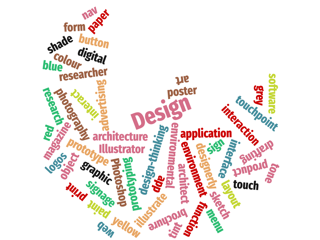
Figure 1: An example tag cloud created with wordclouds.com.
Important points on infographics
- Infographics must be able to stand alone even though they appear within a larger piece of design (e.g., brochure, website).
- Thoroughly research your topic. Your content should drive the type of infographics you use.
- Choose a design scheme compatible with the overall design.
- Choose colours with high contrast of value. Your design should work in black and white
- Provide citation for your data sources.
- Keep ornamentation to a minimum.
- Make sure the writing succinct (p. 176-177).
Infographic ethics
- You should always represent all of the data.
- Always give credit to the sources of data or any other third-party assets used (assuming it’s not general knowledge).
- Time should be in regular intervals.
- Economic data should account for inflation or deflation and be presented consistently (i.e., in the same value).
- Any comparisons made should be valid and should make sense.
- Visualising location-based data with a map paints a clearer picture. See the components of a map graphic on p. 178.
Further reading on infographics with interactive graphics: NeoMam Studios (n.d.) Thirteen Reasons Why your Brain Craves Infographics. https://neomam.com/interactive/13reasons/.
Data visualisation
- An area of design which can sometimes involve some high-level computation.
- At its most basic, it includes many of the common charts and graphs that we all know — bar graphs, pie charts, fever graphs, scatter (plot) graphs, and so on.
- Some visualisations can include enormous datasets and animated and/or interactive components.
- Others are much more artistic and abstract. The important thing with infographics is to communicate clearly.
This video from PBS on data visualisation shows some interesting examples:
Web design
At a minimum, a webpage requires a header region, a content region and a footer. Beyond that, there are several possibilities. A handful of them are covered here: Babich, N. 2019. Top Website Layouts That Never Grow Old. https://xd.adobe.com/ideas/principles/web-design/11-website-layouts-that-made-content-shine-in-2019/
Note that many websites these days use a horizontal menu rather than vertical. Dropdown menus with a “hamburger” icon that work on both desktop and mobile sites are also popular. This syllabus website uses a hamburger icon for smaller devices.
How Web design differs from other design
- Things like fonts and colours can render differently depending on the device.
- Layouts have to adapt to various screen size: everything from a smart phone to a widescreen monitor.
- Websites are nonlinear—users can jump from page to page and have to account for this in their information architecture.
- Websites are interactive.
- Websites can include video and other animation.
Wireframes
Web and app designers create wireframes—a skeleton of a design—before designing the actual site or app. Nowadays, it is common to start designing the mobile version first.
See p. 229 of the textbook for more details on wireframes.
When designing for the web
- “Simplify—but don’t skimp on—content (whittle content to what mobile users need and want).
- Make clickable areas at least 44 × 44 pixels (the size needed for most fingertips).
- Think accessibility. Larger font sizes (readable without zooming) and good contrast are helpful for those with less-than-perfect eyesight. Add extra line-spacing while you’re at it.
- Use proximity. Place controls close to the content they modify.
- Avoid “hover states” (where boxes and other popups appear on mouseover). Hover states behave badly on smartphone interfaces and may cover up other content on an already tiny screen.
- Use only broadly supported animation and video file formats.
- Strike a balance between optimising for speed and providing high-quality graphics” (p. 236).
Back to top | © Paul Haimes at Ritsumeikan University | View template on Github