Topic: Typography
This material covers weeks 5-6 of the course.
Note that this material is subject to ongoing refinements and updates!
Overview
This theme will explore how to work with type. It will also include a bit about logos.
Typefaces and fonts
A typeface or font family is a collection of fonts. Helvetica Regular and Helvetica Bold are examples of fonts, while Helvetica is the typeface or font family. A glyph is a single character in a font. The reality though is that many people use the terms typeface and font interchangeably!
Font categorisations
Some useful font categories to know include:
- Old styles and transitionals, which have serifs and are easy to read, thus effective for body copy.
- Sans serifs, which lack serifs and work well onscreen.
- Scripts, which look like handwriting and are best for very short copy situations.
- Decorative fonts, which vary widely in styling and are best for short-copy decorative situations—headings especially.
- Modern fonts, which have extremely thin serifs and are not a good choice for large amounts of copy, but work well for headings and logos.
- Slab serifs, which are heftier versions of old style and excellent for headlines.
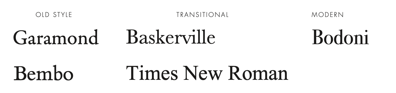
Figure 1: Categorisations of serif typefaces
Sans serifs can be further classified as Grotesque (uniform stroke thickness), Humanist (varying stroke thickness and Geometric (based on geometric shapes).
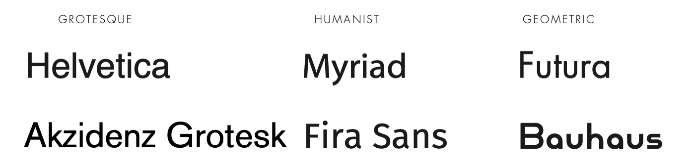
Figure 2: Categorisations of sans serif typefaces
Choosing and using fonts
- Choose one font for the majority of your body copy. Use bold and italic or oblique fonts sparingly.
- Choose a second contrasting font for headlines.
- Font sizes are important. Never use less than 10-12 point for body text. Note that different
- fonts render sizes differently.
- Use contrast with text hierarchy. Don’t be scared of big fonts!
- Font widths matters too, especially for body text. Don’t use bold for body text, but also don’t use light fonts because they become too hard to read.
- “Ascenders and descenders create reading rhythm. Regular pacing makes easier reading” (Hagen & Golombisky, 2017, p. 95).
Several free fonts are available via Google Fonts: fonts.google.com. Lunacy users already have access to these fonts through the Lunacy interface. The League of Moveable Type is also a useful resource for free type, which also contains a lot of useful advice for using type: theleagueofmoveabletype.com. Subscribers to Adobe CC can access fonts through fonts.adobe.com.
Familiarise yourself with the principles of typographic hierarchy:
Ein, D. (2023). Understanding Typographic Hierarchy.
https://design.tutsplus.com/articles/understanding-typographic-hierarchy--webdesign-11636
Ways to use type decoratively (i.e., for headings or logos)
- Small caps (Several fonts have caps-only versions).
- Tabs and tab leaders (Examples shown in class).
- Reversed type (but only for headings!).
- Initial and drop caps (Such as the start of a book chapter).
The main ways to manipulate type
- Leading (line height) determines the spaces between lines of text. It is one of the three main ways that you can influence the legibility of type. As a general rule, line spacing should be around 120–145% of the font size.
- Kerning refers to the spaces between individual letter pairs. Generally you would only do this with display text.
- Tracking is the letter spacing across a whole word. If you want to change the letter-spacing across entire sentences or paragraphs of text, this is the way to do it.
A video on basic font manipulation (Note that these videos are using Adobe software, but much of what they say applies to typography generally):
Some pointers for working with leading, tracking and kerning:
- If a chunk of text (even a heading) is hard to read, something is probably not set correctly.
- Take care of leading and tracking before kerning.
- Create equal perceived space between letters (when kerning).
- Understand spatial relationships between different letters.
- Use different kerning or tracking solutions for large and small type.
- Always trust your own eyes, rather than relying on software!
A video on typesetting 101:
Useful resources on font pairing
- Colophon. (n.d.). Perfect Pairings. https://fonts.google.com/featured/Perfect+Pairings
- Shoaf, J. (n.d.). Five Fresh Headline and Body Text Pairings. https://fonts.google.com/featured/Five+Fresh+Headline+and+Body+Text+Pairings
- Shoaf, J. (2021). The 40 Best Free Fonts Available on Google Fonts. https://www.typewolf.com/google-fonts
- https://www.fontpair.co is also a useful community-based resource for font pairing.
Installing fonts on your PC
- Instructions for Mac users: https://support.apple.com/en-us/HT201749
- Instructions for Windows users: https://support.microsoft.com/en-us/office/add-a-font-b7c5f17c-4426-4b53-967f-455339c564c1
Font recommendations
The below typefaces are already installed on Lunacy, via Google Fonts.
Serif
- Roboto slab
- Libre Baskerville
- Libre Caslon
- Source Serif Pro
- EB Garamond
- IBM Plex Serif
Sans serif
- Roboto
- Fira Sans
- Montserrat
- DM Sans
- Source Sans Pro
- Raleway
Display
- Pacifico
- Amatic SC
- Bebas Neue
- Carter One
- Poiret One
- Abril Fatface
- Great Vibes
- Bevan
Note that many of these typefaces are part of a larger family, which makes font pairing much easier (for example, try pairing Roboto Sans with Roboto Slab)! Mac users also have access to both Helvetica and Helvetica Neue, which are often used in design (some might say too much). Segoe UI and Calibri on Windows PCs are both good sans serif typefaces.
Logos
5 principles of effective logo design from Cass (2009):
- Simple
- Memorable
- Timeless
- Versatile
- Appropriate
Cass, J. (2009) Vital Tips For Effective Logo Design. https://www.smashingmagazine.com/2009/08/vital-tips-for-effective-logo-design/
Logobook is a resource containing thousands of logos spanning several decades. We will look at logos in further detail when we look at images in design.
Watch the video below with Aaron Draplin of Draplin Design Co designing a logo.
Back to top | © Paul Haimes at Ritsumeikan University | View template on Github