Topic: Images in design
This material covers weeks 9-10 of the course.
Note that this material is subject to ongoing refinements and updates!
Overview
This theme covers working with visuals in design.
The realism continuum
- The realism continuum (Medley, 2009) can help us to examination images in terms of their relationship to realism.
- Images at the realistic end of the continuum can help us in cases where identification and differentiation are necessary.
- At the abstract end where things are increasingly stylised, images can help us where categorisation and grouping are necessary.
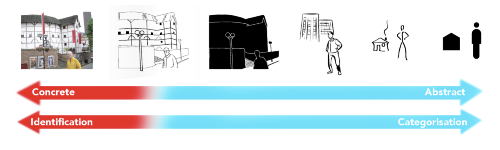
Figure 2: The realism continuum, courtesy of Stuart Medley (2009)
Even when presenting something as simple as a piece of fruit, the medium makes a significant difference:
“meaning may be imparted through the perceived feel of the medium (softness, hardness, fluidity, or stiffness) and, sometimes, through its conceptual or allusory aspects (for example, using a drawing tool native to a certain region or historical period for a project related to that region or period)” (Samara, 2014, p. 200).
Photography
A guide to cropping in photography:
Though the examples in these videos use Photoshop, cropping can be done in free software on your smartphone or on apps such as Photos on Mac.
Basics of photography
Aperture, shutter speed, and ISO are sometimes referred to as the exposure triangle. Start by understanding what these settings do on a camera (note that some smart phone apps will allow you to adjust these features), and experiment with how they can be used together to produce certain effects:
- Aperture (how wide or narrow the opened lens is), usually expressed as an F number. A low number, like F1.8, will have a low depth of field, and a blurred background aside from the subject. Good for taking photos of flowers, and portraits. A high number, like F8 or above, gives a wide depth of field, so better for taking photos of things like landscapes or buildings.
- Shutter speed. This can be very fast - 1/1000 of a second or even less, but 1/200 can take photos of many things without introducing motion blur. Taking a photo at night in low light might require a shutter speed of 1-5 seconds. Some cameras will allow you take photos over 30 minutes or more. This can be useful if your photos include the night sky and you want to have stars in your photo.
- ISO sensitivity, where ISO refers to International Organization for Standardization. The ISO setting used to be determined by the film you used, but now it's just another setting on digital cameras. ISO is simply a numberical representation of how sensitive the film or sensor is to light. ISO is usually 100 at the low end, which is enough for most sunny days. Cloudy days might require an ISO of 400 or 800. Night shots would probably require an ISO above 800, but note that ISO above around 1000 begins to introduce grain (which can be a pleasing effect). Some cameras have extremely high levels of ISO 100,000 or more.
Some camera modes allow you to set just one of these settings while automating others, such as Aperture Priority or Shutter Priority, while Manual on most cameras will allow you to adjust all of these settings.
For some photography basics, including a little bit about the history of photography, check out the VSCO website: Photography Basics. The Adobe website also has more about exposure in photography.
Photography as art
Harry Callahan (1912-1999) was an American photographer and educator:
“The difference between the casual impression and the intensified image is about as great as that separating the average business letter from a poem.
If you choose your subject selectively — intuitively — the camera can write poetry” (1964).
Several of Callahan's works are viewable online via the Museum of Modern Art: https://www.moma.org/artists/924
“I have finally freed myself from the sticky medium of paint, and am working directly with light itself”
— Man Ray (1922).
An interesting contemporary artist working in photography is Frances Seward: https://francesseward.com
Illustrations
- Illustrations are particularly useful as a communication tool: “Because illustrations appear to mimic aspects of visual perception itself, they seem to be appropriate for a wider range of tasks than both very concrete or very abstracted imagery” (Medley, 2013, p. 5). They are frequently used in design (and other creative fields) for techniques such as brainstorming and storyboarding.
- The great thing about sketching as a communication tool — and why it should be encouraged in creative fields — is that even the most basic sketches can be done by almost anyone. Even the simplest sketch can communicate more easily than words.
- Like photos, illustrations can be expressive in a number of ways through several techniques. This is largely dictated by the skills and preferences of the illustrator.
- Instructional materials rely on detailed technical drawings to communicate. Could you imagine how much more difficult IKEA instructions would be if it was using photos instead of illustrations?
Illustration with design software requires working with vector paths:
Important ways of using illustrations
- Illustration gives form to the imaginary: “For hundreds of years, illustrators have been giving visual form to people, places and things found only in the imagination. Fiction (for both adults and children) is full of wonderful illustrations that bring everything from fairies to flying monkeys to life” (Hagen & Golombisky, 2017, p. 156).
- Illustration for sensitive subject matter. Aside from the crime-related examples given in the textbook, caricatures of famous people (politicians especially) can be used to imply certain characteristics without stating them too overtly.
- Illustration to show change over time. This technique can be used to show a particular chain of events, or provide specific instructions.
- Illustration evokes history. By adopting the style of a particularly time or place, illustrations can create a particular feeling.
Consider these points if using illustrations in design:
- “Illustrations, like photographs, are usually chosen or commissioned with output in mind.
- The mood projected in an illustration is largely controlled and dictated by illustration technique as well as the medium.
- Illustration allows flexibility of interpretation.
- Illustrations also can help an audience visualise something that cannot be seen or help an audience better understand a complex concept” (Evans & Thomas, 2013, p. 100).
Symbols and logos
Symbols are at the more abstract end of images. Reducing a symbol to its simplest representation is referred to as graphic reduction. Symbols are often a component of logos, but also icons in websites and apps, as well as in way-finding situations.
Important terms
- Within symbols we find ideograms or ideographs: symbols which represent ideas. The icons that we find in apps and on websites are examples of ideograms.
- Pictograms or pictographs are a type of ideogram that rely solely on a pictorial representation of an idea. Such symbols need to be recognisable quickly and easily.
- Logotype refers to “letters, words, or a name formed in a distinctive way and used symbolically to represent a product, brand, company, or group...
- Mark refers to a symbol used to represent a product, brand, company, or group” (Evans & Thomas, 2013, p. 104).
- A logo is a logotype, mark, or both combined. Logos can appear across a variety of media: business cards, brochures, websites and apps, clothes, billboards...
More about logos
- A logo is a visual emblem that represents an organisation. They can include ideographs or pictographs, text, abstract forms, or some combination of all of these.
- As printed materials became more common in the 19th century (such as the Coke logo, designed by Frank Mason Robinson in 1885), some of the first recognisable logos started to appear.
- In the early 20th century, logos became more common in both Europe and the United States. One logo that remains unchanged from that time is the Olympics logo, designed by Pierre de Coubertin in 1914.
Some of these examples are from Lant, K. (2017). The history of logos. https://en.99designs.jp/blog/design-history-movements/the-history-of-logos/.
Paul Rand (1914-1996) - perhaps the most noteworthy logo designer, claimed:
“The principal role of a logo is to identify, and simplicity is its means... Its effectiveness depends on distinctiveness, visibility, adaptability, memorability, universality, and timelessness”.
Japanese graphic design
Much Japanese design draws on elements of traditional Japanese arts and culture. This trend has continued despite adopting aspects of modernist design from Europe and the Anglosphere.
Japanese logos often incorporate Japanese characters, although many logos also feature romanised text. Often, kanji is combined to create a logo, a technique known as a monogram. Japan has its own history of symbology in the form of hand-drawn seals, known as mon (紋). Several examples are shown here: http://www.kyogen-kamon.com/design-ah.
Imagery sources with open copyright licensing
Copyright matters. You can't just copy imagery from the web and use it freely - you need to consider who owns the rights to the image. For more on copyright, refer to the Golombisky and Hagen book (p. 155). However, there are many sources for images that have permissive licences. Aside from the photos available on Lunacy, there are several stock libraries online. For example:
- https://commons.wikimedia.org - note also that the imagery on Wikipedia, including maps, often comes with a creative-commons license
- https://unsplash.com/images/stock
- https://www.pexels.com
- https://www.pngwing.com - several PNG images with open copyright
In your final assignment, you should include credits of where your photos are from.
Practicing paths with the pen tool
Try tracing the shapes on this webpage using the pen tool in Lunacy:
https://laurenfernandezblog.wordpress.com/2016/06/09/pen-tool-practice/
Creating pie charts
Pie charts in Lunacy (or Sketch) are annoying to create (see this video, which isn't in English, if you really want to know how). I recommend that you can create one in other software such as Powerpoint, Keynote, or Excel, and copy it into your Lunacy design.
Back to top | © Paul Haimes at Ritsumeikan University | View template on Github