Human vision
This material covers week 6 of the course.
Note that this material is subject to ongoing refinements and updates!
Overview
This theme covers how humans read, and how we perceive colour.
Reading is unnatural
This might sound extreme in a university setting (where you should be reading intensively and extensively!), but in terms of human history, we have been speaking and listening to language for hundreds of thousands of years, yet reading and writing have a far shorter history. We grow up absorbing and speaking language quite naturally, whereas reading is something that requires rigorous instruction and practice because it isn't an innate ability.
Reading: Feature-Driven vs. Context-Driven
- Reading involves both feature-driven (bottom-up) and context-driven (top-down) processes.
- Feature-driven reading starts with basic features of the text, such as word choice, syntax, and sentence structure.
- Context-driven reading starts with overall meaning and tone of the text.
- Skilled readers primarily use feature-driven reading.
- Poor readers rely heavily on context-driven reading due to difficulty with feature-driven processing.
- Context-driven reading can interfere with comprehension for poor readers.
- Lack of early reading experience can hinder development of automatic feature-driven reading.
Modern brain imaging techniques (such as EEG, fMRI, and fMRS) allow scientists to observe brain activity in real-time, demonstrating that brain activity patterns differ between novice and skilled readers:
- Novice readers "sound out" words, activating areas involved in word analysis and meaning extraction.
- Skilled readers recognise words as wholes, directly activating meaning and mental image areas, bypassing the word analysis stage.
Bad information design disrupts reading
As a designer, you want to promote readers' smooth comprehension of the text, which is a matter of both content and its presentation:
"Careless writing or presentation of text can reduce skilled readers’ automatic, context-free reading to conscious, context-based reading, burdening working memory, thereby decreasing speed and comprehension. In unskilled readers, poor text presentation can block reading altogether" (Johnson, 2021, p. 39).
Promoting a smooth reading experience
Things in particular to avoid to promote a smooth reading experience:
- Uncommon or unfamiliar vocabulary – especially technical jargon that is likely unknown by most users.
- Difficult scripts and typefaces. Don't use display fonts for body text. Instead, choose something built for reading larger passages of text, such as Arial, Times New Roman, Helvetica Neue, or Verdana. Always avoid ALL CAPS for body copy.
- Tiny fonts. Try to stick to a font size of at least 11 or 12pt (or 15-16px in CSS).
- Text on noisy background. Just... don't. Always provide a large amount of contrast between foreground and background.
- Information buried in repetition
- Centred text. We're used to reading left to right. Centring text is rarely a good idea, and it also makes a mess of lists.
- Combining flaws that disrupt reading.
Guidelines for supporting both context-driven and feature-driven reading:
- Ensure that text in user interfaces allows the feature-based automatic processes to function effectively by avoiding the disruptive flaws described above: difficult or tiny fonts, patterned backgrounds, centring, etc.
- Use restricted, highly consistent vocabularies—sometimes referred to in the industry as plain language or simplified language Format text to create a visual hierarchy to facilitate easy scanning: use headings, bulleted lists, tables, and visually emphasized words (Johnson, 2021, pp. 46-47).
Perhaps most importantly though: you should “minimise the need for reading” wherever possible (Johnson, 2021, p. 50).
What is colour?
Note: This is revision from DESN1001.
The colours we see are just one small part of the electromagnetic field. Generally, most of us have a set of three different cone photopigments in our eyes, which means we all share a similar colour experience. But due to the complexities of how our brains handle this input, we all experience colour a bit differently. Therefore, we can presume that there is a fair bit of subjectivity in how we perceive colour!
If you aren’t familiar with it, you should learn and understand the colour wheel, and the relationships between different colours within it:
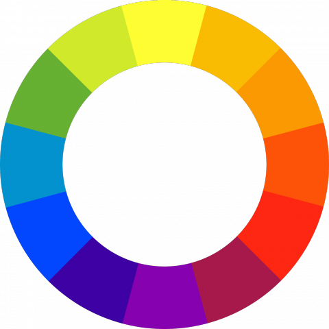
Figure 1: The contemporary colour wheel
The modern colour wheel (pictured) displays three categories of colours: primary colours (red, blue, yellow), secondary colours (created by mixing two primary colours), and intermediate or tertiary colours (created by mixing primary and secondary colours).
Colour perception
Human vision is optimised for edge contrast, not brightness: This means that rather than viewing colours as absolute values, the colours we see are influenced by the surrounding colours. See the figure below: the greens appear to be different shades because of the surrounding colours.

Figure 2: Adjacent colours determine how a colour is perceived.
Ability to discriminate colours depends on how colours are presented. We have difficulty distinguishing colours, particularly due to three factors:
- Paleness - less saturated colours are harder to distinguish
- Colour path size - thinner or smaller objects make colours harder to distinguish
- Separation - especially when objects are far enough apart that they require eye movement.
Colour blindness
There are several types of colour blindness. Designers need to consider how different colours work together. Red-green is the most common type — affecting around 8% of all men with Northern European heritage. There is also blue-yellow (trouble distinguishing between blue and green, and red and yellow) and complete (no colours!!). Designers can still account for various types of colour blindness by using a high contrast of colour values.

Figure 3: A sample Ishihara colour test plate. The number "74" should be visible to those with normal colour vision. Those who see something else, such as "21", may have red-green colour blindness.
External factors
External factors that influence the ability to distinguish colours
- Variation among colour displays - Different devices render colour (and contrast between them) differently
- Grayscale displays - There are still some devices that don't have colour displays
- Display angle - Colours and contrast can change at different angles
- Ambient illumination - Glare from the sun and other sources of light can affect how we see a display
Designing interfaces with colour
When designing interfaces with colour, designers need to consider the following aspects of human vision:
- Our vision is optimised to detect contrasts (edges), not absolute brightness.
- Our ability to distinguish colours depends on how colours are presented.
- Some people have colour-blindness (See above).
- The user’s display and the viewing conditions affect colour perception (Johnson, 2021, p. 53).
More guidelines for designing with colour:
- Distinguish colours by saturation and brightness as well as hue
- Use distinctive colours
- Avoid colour pairs that colour-blind people cannot distinguish
- Use colour redundantly with other cues
- Separate strong opponent colours (Johnson, 2021, pp. 61-62)
Back to top | © Paul Haimes at Ritsumeikan University | View template on Github